|
|
Post by H2IZCOOL on Sept 2, 2008 8:50:21 GMT -5
Right, those drill holes were the same as LP's with the corners cut off of the jackets -- commonly referred to as "Cut-Outs". Like you say, they were typically overstocks, titles deleted from the label's catalog, promos, or used for jukebox play -- any case where the LP or single was not sold for full price. The defacement of the product was done primarily to keep someone from returning the item to the store for full credit, and also to keep stores from returning the product to the label for full credit. Places like White Front or Zody's usually had huge sections of cutout LP's for a buck or two a piece, and bags of 45's like you mention. I just wish I had been a little older back then and taken advantage of those offerings! Daniel, your rationale for why the hole was drilled obviously makes more sense than mine, although I do remember a store clerk giving me the rationale that I posted. I suppose they didn't want to give me ideas about returning records which were discounted but had no hole drilled. As for you wishing to have been old enough to have taken advantage of those offerings -- I'd be glad to switch places with you!  |
|
|
|
Post by Dawn on Sept 2, 2008 10:49:42 GMT -5
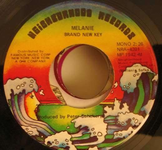
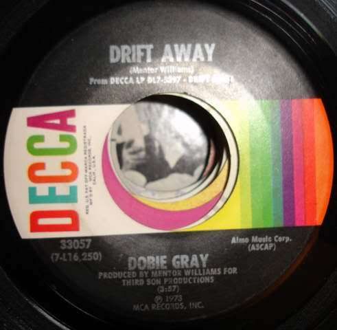
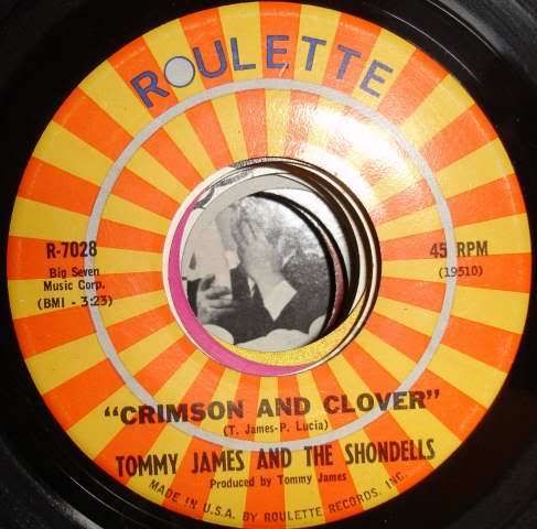
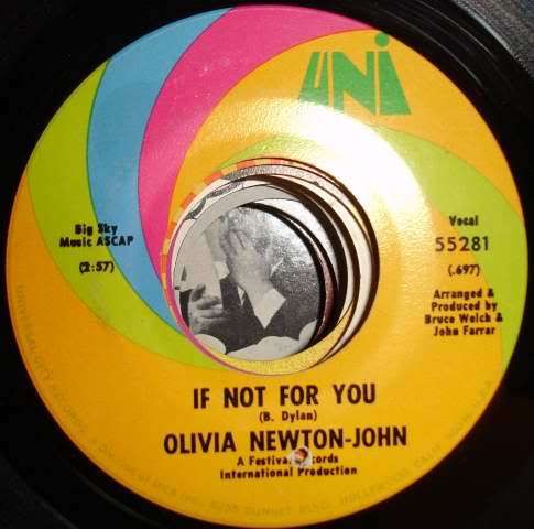
Neighborhood is another cool one, but I think you'll only find Melanie singles on the label...  (I like how that wave is a face...) I much prefer this Columbia design to the more common 70's/80's design that had "Columbia" in that Pac-Man-esque font. I always thought that label was U-G-L-Y.  Decca was another cool design. I read somewhere that "Drift Away" was the last single released on the Decca label before it and Kapp/Uni were folded into the "MCA" name. That seems about right as my copy of Dobie Gray's "Loving Arms" is on the MCA label.  The 60's Roulette design is also nice, but the 50's label that looked like an actual roulette wheel was also cool. (I have a few 45's with this design, but those seem to still be in California)  Judging fromt he fonts used on this label this particular 45 was pressed by Columbia. And judging by the banner at the top of the page, the UNI label is a favorite of others here as well!  Ah .. I see that little hole drilled into the Uni Label. If I remember correctly, I think they did that to make the record "imperfect" so they could sell it at a discount price. I remember back in the '60s and '70s, stores like K-Mart had bins filled with records like that, all with holes drilled in them, all in little individual plastic bags, selling for 39 cents each; 3 for a dollar. The drilling was done by machine, and every now and then, the hole would go through the grooved part of the record rather than the label, making it truly worthless.  I remember the Nichols store had a huge bin of those bagged 45s, which were great fun to look through. I think a lot of the records they sold were "lower-tier" singles - possibly top 100 but not quite top 40 - but I do recall finding a few more popular hits in there, among them the Captain & Tennille's Love Will Keep Us Together and Rhythm Heritage's Theme from SWAT. I still have a couple of those green plastic bags that those 45s came in. |
|
|
|
Post by H2IZCOOL on Sept 2, 2008 11:50:31 GMT -5
Ah .. I see that little hole drilled into the Uni Label. If I remember correctly, I think they did that to make the record "imperfect" so they could sell it at a discount price. I remember back in the '60s and '70s, stores like K-Mart had bins filled with records like that, all with holes drilled in them, all in little individual plastic bags, selling for 39 cents each; 3 for a dollar. The drilling was done by machine, and every now and then, the hole would go through the grooved part of the record rather than the label, making it truly worthless.  I remember the Nichols store had a huge bin of those bagged 45s, which were great fun to look through. I think a lot of the records they sold were "lower-tier" singles - possibly top 100 but not quite top 40 - but I do recall finding a few more popular hits in there, among them the Captain & Tennille's Love Will Keep Us Together and Rhythm Heritage's Theme from SWAT. I still have a couple of those green plastic bags that those 45s came in. The ones I remember, Dawn, were all tiers. There were enough top 10 songs in there, that I would be there frequently adding to my collection for top 100 of each year. This was at a K-Mart and also at a Woolco in Bangor, ME back in the late '60s-early '70s time period. |
|
|
|
Post by Railyn on Sept 3, 2008 20:26:45 GMT -5
I have that same Crimson and Clover 45.
|
|
|
|
Post by H2IZCOOL on Sept 3, 2008 21:34:37 GMT -5
Here's one of those plastic baggies I was referring to with a 45 in it. This 45 may not have come in that bag -- probably didn't. But it was the first one in a bag I happened to grab tonight, and the sentiment is shockingly apt.  |
|
|
|
Post by Dawn on Sept 4, 2008 10:05:23 GMT -5
Here's one of those plastic baggies I was referring to with a 45 in it. This 45 may not have come in that bag -- probably didn't. But it was the first one in a bag I happened to grab tonight, and the sentiment is shockingly apt.  Cool! That looks like an earlier version of the ones I found in the '70s - the price is the same, but the bags were a lime green color with red and white lettering. I'll have to get one out and scan it. |
|
|
|
Post by daniel on Feb 19, 2009 16:56:09 GMT -5
I've posted some photos of various 45 labels from my collection on my Flickr page. (I tried that link fixer Railyn posted, but I think it just works for individual photos and not links to sets. Or I just didn't do it right. Either is a possibility.) www.flickr.com/photos/67661849@N00/sets/72157613982569712/ |
|
|
|
Post by Railyn on Feb 19, 2009 18:01:31 GMT -5
Yep - that's just for photos.
I finally saw what you were doing wrong.
When you post the URL, make sure you highlight the URL completely, and then add the URL operators to it by clicking on the button (it's the 3rd button on the 2nd row (2 past the youtube button).
In lieu of that, just add {url} (however, you need to replace the "{" with the "[" - if I use the bracket in my example, it will dissappear) to the beginning of the URL, and {/url} to the end of the url.
This forum system is smart enough to recognize URL's without the operator, but it breaks the link when it gets to the "@" sign. By telling it that the whole entire thing is a URL, it doesn't break.
Yeah, that sounds complex, but it's really not. ;D
I fixed it for you.
|
|
|
|
Post by daniel on Feb 20, 2009 16:37:50 GMT -5
Ah, so I should stop using the "Quick Reply" then...
|
|
|
|
Post by Dawn on Feb 21, 2009 21:12:13 GMT -5
You have a cool selection of label designs and sleeves on your site, Daniel. I have a couple of the RCA Gold Standard Series 45s and the A&M original, Forget Me Not and Memories designs, and one or two 20th Century ones.
That Bell country sleeve is very cool, and I'm guessing it's pretty rare. I've always liked the Roulette design as well - it looks especially nice paired with the original sleeve as you posted.
|
|
|
|
Post by daniel on Feb 22, 2009 10:10:55 GMT -5
Thanks, Dawn! From what I have been able to tell, Bell only issued a handful of singles under that "Country Series" banner, all around 1969, and none of them were hits. They did have hits on the Country charts in the 70's but those were on the regular Bell label.
I posted a few more 45's last night. At some point I have to go through and re-organize them. I had them all neatly arranged at one time, but that went out the window once I moved.
|
|
|
|
Post by Dawn on Feb 22, 2009 13:03:07 GMT -5
I vividly remember that Capitol "Target" label from my childhood days. My parents had a bunch of 45s on that label, including Merle Haggard's Daddy Frank, which was played often.
I've always liked the MCA rainbow designs. I think for a couple of years, 1978-79 or so, they issued some 45s, like Olivia Newton-John's Deeper Than the Night, with a plain beige label (which I never liked, very boring), but then went with the updated rainbow design in 1980.
I think that's the first Monument '70s sleeve I've ever seen. Very cool!
|
|
|
|
Post by daniel on Feb 22, 2009 15:13:50 GMT -5
You're right there was a yucky beige "design" in between the rainbow designs. I know I have some 45's with this design, I just haven't come across them, yet. I have another dresser drawer and 4 or 5 boxes of 45's to go through, yet!  I think Monument was pretty much on it's deathbed by the time that Roy Orbison single came out in '77. They were bankrupt by 1980, I think. |
|
|
|
Post by Pete70s on Feb 22, 2009 21:50:03 GMT -5
You're right there was a yucky beige "design" in between the rainbow designs. I know I have some 45's with this design, I just haven't come across them, yet. I have another dresser drawer and 4 or 5 boxes of 45's to go through, yet!  I think Monument was pretty much on it's deathbead by the time that Roy Orbison single came out in '77. They were bankrupt by 1980, I think. I was never a fan of any of the MCA label designs. For some reason I've attatched a stigma to MCA as being "cheap" looking. Maybe because of all the cheesy-looking budget line reissues they put out of classic albums by The Who and Steppenwolf (on the regular rainbow label design). Maybe because they were a "conglomerate" of a bunch of classic labels that got disolved into one label (rather than having a history of their own). Possibly for that reason, I never took them seriously as a "real" label like Atlantic or Capitol. They did have a plethora of great artists, though! |
|
|
|
Post by daniel on Feb 22, 2009 22:04:12 GMT -5
Ah, those "Sound Savers" or whatever they were that had that "budget" designation printed right on the cover itself so you could never hope to remove it? I didn't find *those* issues to be as cheap as say a Pickwick or Harmony release, but they were tacky nonetheless because of that printed on "budget" designation. It's as if they WANTED to tell people "You bought this at Kmart, not Tower (or Peaches) like you said!!!"
Since I was a young'n in the 80's I only ever knew of MCA -- it wasn't until later I heard of Decca, Kapp or UNi. The Decca design is a favorite of mine, though, mainly because it's fancy while being simple all at the same time if that makes any sense.
|
|