|
|
Post by Dawn on Nov 17, 2009 12:05:39 GMT -5
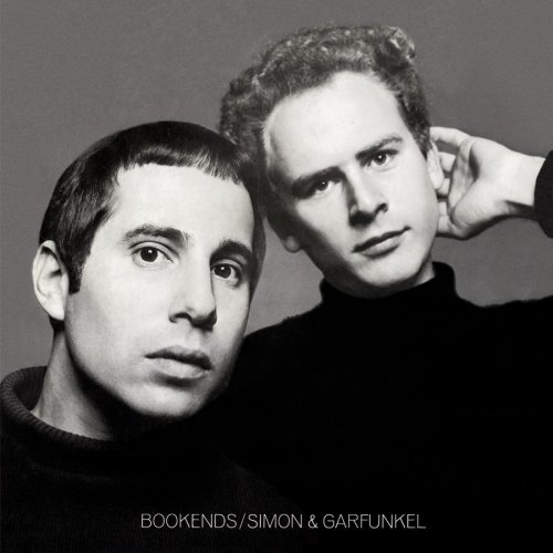
Borrowing this topic idea from another board...thought it would make for good discussion here. What are some of your favorite group poses from their album covers? For the Beatles, I've always been partial to this one:  In terms of the album cover overall, it's a bit bland and utilitarian (although many artists' album covers were up until the mid '60s, when cover design became more important.) But the photo itself is great, a very nice shot of all four of them. Some sources I've seen date it as having been taken in fall 1964. The Beach Boys were not known for great cover designs, but I do love this particular shot:  One of very few covers to feature all six main band members, and they all look very cool and hip. The "stacked tracks" concept and the perspective the photo is shot from add to the visual interest. This shot dates from March 1968. This is a nice shot of the group America:  Probably dates from early 1975. The guys appear very somber on their earlier albums, but look happier and more relaxed here. The Golden Gate Bridge in the background adds a nice touch. |
|
|
|
Post by Ken on Nov 17, 2009 21:32:20 GMT -5
Here are three of my faves: The Beatles:  I believe this was taken around the same time as the photo for Beatles VI but I'm not 100% positive. I've always really liked this cover. Two great photos using a "fish eye" lens The Byrds:  I would imagine that this was probably somewhat groundbreaking and "far out" for 1965. Jimi Hendrix:  Not only is Jimi's shirt very cool but I really like how the color tint used in the photo matches the lettering. |
|
|
|
Post by Dawn on Nov 17, 2009 22:44:43 GMT -5
Here are three of my faves: The Beatles:  I believe this was taken around the same time as the photo for Beatles VI but I'm not 100% positive. I've always really liked this cover. Two great photos using a "fish eye" lens The Byrds:  I would imagine that this was probably somewhat groundbreaking and "far out" for 1965. Jimi Hendrix:  Not only is Jimi's shirt very cool but I really like how the color tint used in the photo matches the lettering. Ken, I believe you are correct about that Beatles 65 photo being taken at about the same time as Beatles VI. The guys' hair lengths and styles look very similar in both photos. The '65 cover is one I've always liked a lot as well. I think that Byrds cover is probably one of the earliest to feature that "fish eye" perspective. Great photo! The color combination used on the Jimi cover is very eye-catching and looks great alongside the group shot. Very innovative, like the music! |
|
|
|
Post by m c dornan on Nov 18, 2009 13:46:59 GMT -5
How do you post pictures here? I tried a couple things that didn't work.  |
|
|
|
Post by jpkansas on Nov 18, 2009 19:05:01 GMT -5
How do you post pictures here? I tried a couple things that didn't work.  Did you use the Image icon and then link to your pics from a photo hosting site such as Photobucket? |
|
|
|
Post by m c dornan on Nov 20, 2009 16:34:39 GMT -5
 r Hey thanks Joe! you reminded me about that "add Tags" section. |
|
|
|
Post by jpkansas on Nov 21, 2009 1:55:49 GMT -5
 r Hey thanks Joe! you reminded me about that "add Tags" section. Happy to help, MC. |
|